ARIMA模型(英语:Autoregressive Integrated Moving Average model),差分整合移动平均自回归模型,又称整合移动平均自回归模型(移动也可称作滑动),是时间序列预测分析方法之一。
所以随机生成一个时序数据来体验一下这个模型,如果感觉数据眼熟纯属巧合。
1 | from statsmodels.tsa.arima.model import ARIMA |
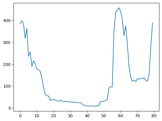
1 | plt.plot(y) #将数据可视化 发现没什么规律很随机 |
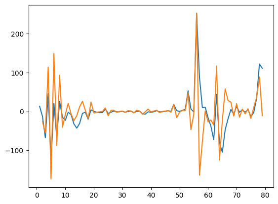
1 | # 由于数据过于随机 所以使用差分将数据归于平稳 这里使用了二阶差分 |
1 | plt.plot(y1) |
1 | # 画一下拖尾和截尾情况 来进一步确定回归参数 |
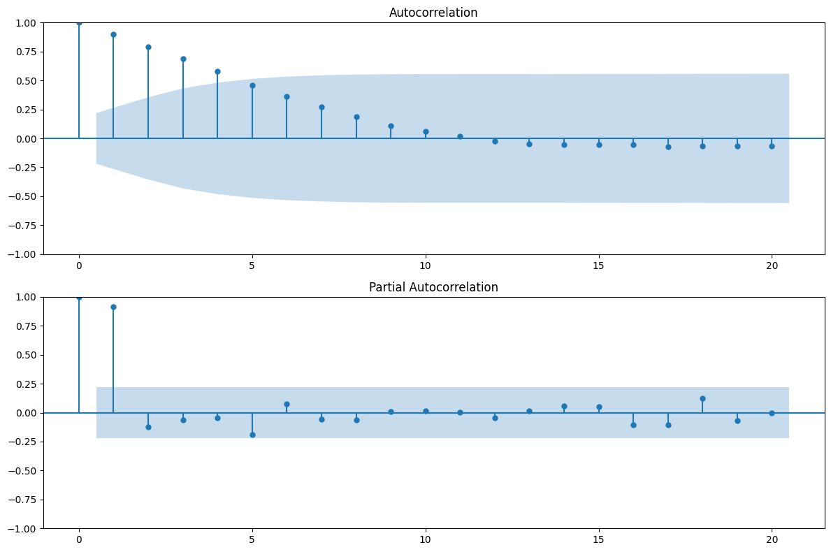
应该差不多就AR(2)
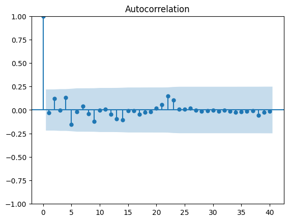
1 | # 使用自带的函数算一下最优参数 |
AIC (3, 0)
BIC (2, 0)
1 | # 根据结果选择200参数 |
可以看到效果还不错 那么模型应该还行
1 | # 将模型拟合结果和原始数据进行对比 |
0     200.149179
1     377.197543
2     390.971790
3     371.277539
4     291.312595
         ...
75    142.792734
76    125.375138
77    125.383622
78    166.839263
79    307.552031
Name: predicted_mean, Length: 80, dtype: float64


<AxesSubplot: >
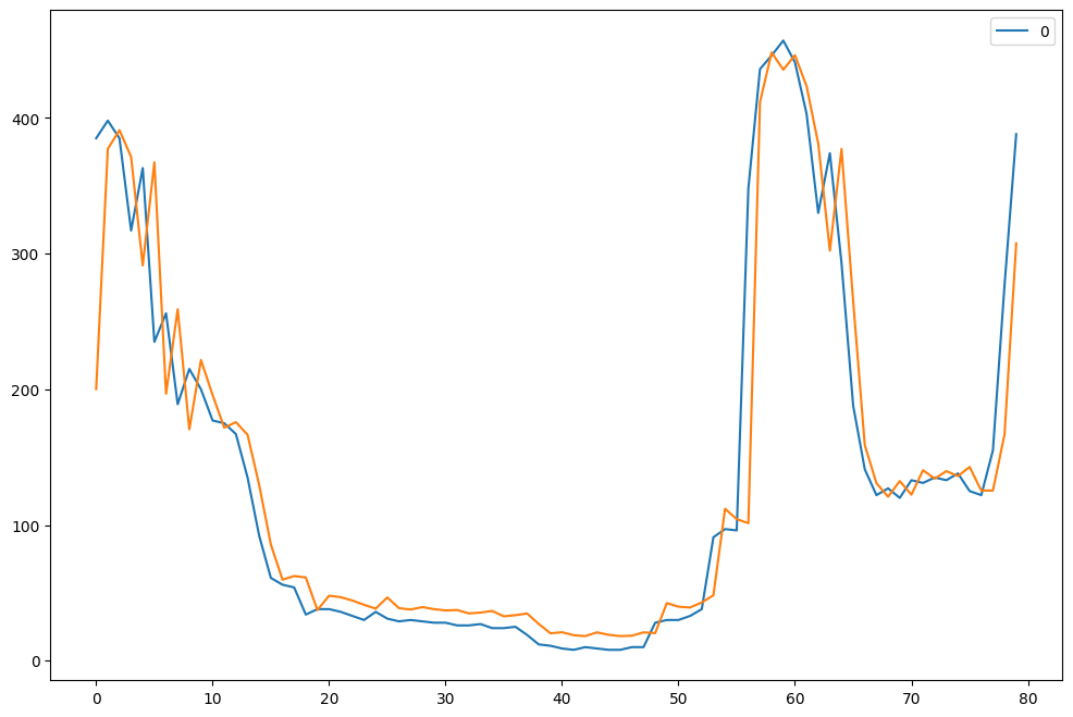
可以说是很相像了,接下来预测未来几十天的情况
1 | r = results.forecast(82) |
| predicted_mean | |
|---|---|
| 80 | 409.403039 |
| 81 | 404.147892 |
| 82 | 391.591249 |
| 83 | 377.637572 |
| 84 | 364.042914 |
| ... | ... |
| 157 | 200.570884 |
| 158 | 200.537803 |
| 159 | 200.507317 |
| 160 | 200.479222 |
| 161 | 200.453332 |
82 rows × 1 columns
1 | # 将预测结果接到原始数据后面并且绘画 |
[<matplotlib.lines.Line2D at 0x2461d51da30>]
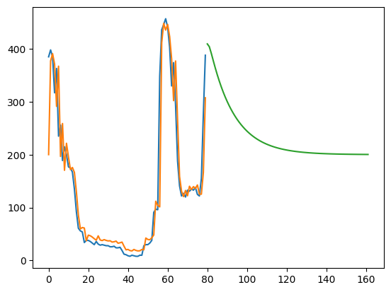
可以看出来几天后将开始下降,但不收敛于0,应该数据集过于波动并且数据量太少。
ARIMA建模过程大概就是这样,感兴趣的可以自己拿数据试着运行一下。如果有大佬对这个模型有好的建议的可以告诉我交流学习一下捏。
若没有本文 Issue,您可以使用 Comment 模版新建。